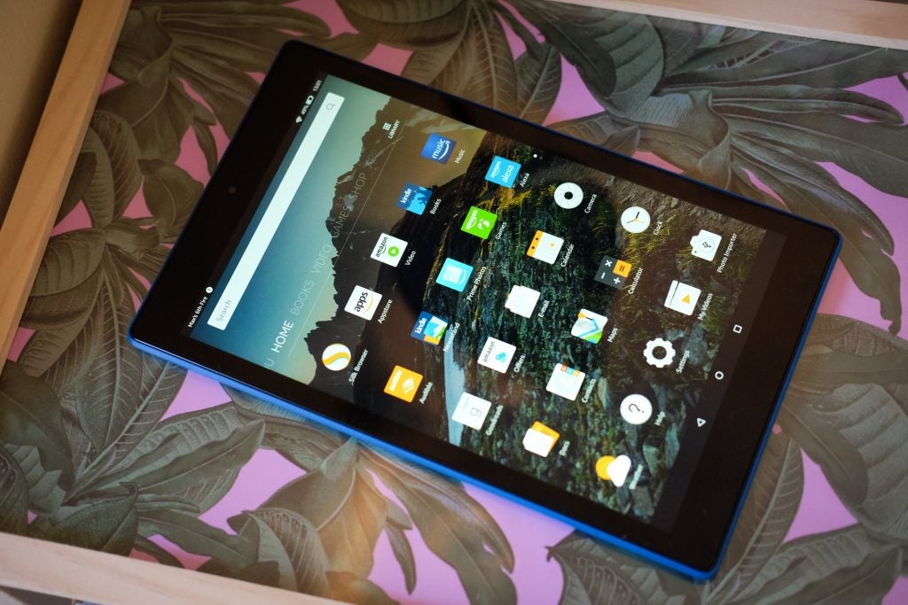
The Amazon Fire HD 10 is the largest and priciest member of the company’s Fire tablet range, sharing in the values of its predecessors in terms of affordability but also bringing new features like a 1080p display.
This affordable slate is ideal for those who’ve bought into Amazon Prime, although if you’re not familiar with the company’s ecosystem, the user experience might be a tad jarring at first. It’s also a good buy if you want to read Kindle books, but want a device that does a little more than the Kindle Paperwhite or Kindle Oasis.
10-inch tab too big for your needs? Amazon’s more compact Fire HD 8 packs many of this device’s feature but in a more compact shell.
Amazon Fire HD 10 – Design
Compared to the majority of similarly-sized slates, the Amazon Fire HD 10 comes in with a footprint that’s larger than most.
After using the HD 10 for more than a few minutes, it’s easy to see why 10-inches is not the go-to size for most tablets. 10-inch tablets like the Fire HD 10 just feel awkward, especially when you try to use them out and about. The HD 10 suffers particularly badly from a top-heavy form and trying to hold it to read books just isn’t a comfortable experience.
So why am I throwing such criticisms at the HD 10 when the likes of Apple’s 9.7-inch iPad might not endure the same scrutiny? The Fire HD 10 is styled as a widescreen tablet, toting a 16:10 aspect ratio. Larger tablets with such proportions always feel more cumbersome than a slate that opts for a more approachable 4:3 aspect ratio or something similar. With this in mind, the Fire HD 10 is best kept for use in the home.
The design of the Amazon Fire HD 10 appears to prioritise ease of engineering over comfort, aesthetics or ease-of-use. All the controls and ports lie along the top face – a trait it shares with so many cheap, unbranded tablets.
This isn’t hugely practical. Held upright it means the controls are out of easy reach and when the device is held in a landscape orientation, your hand will always rest over either the power or volume buttons.
Compromise is a common theme here. While there’s a metal frame inside the Amazon Fire HD 10 that helps to stop it flexing – under normal pressure, it doesn’t flex at all – on the outside, it’s covered in matte plastic. Overall, it just feels a little cheap.
Nevertheless, if you’re picking up the Fire HD 10 for the kids to happily chuck around, or keep entertained on long journeys, it fits the bill perfectly.
The most obvious upgrade to the new version of the Fire 10 is the screen. No longer is it a terrible 10.1-inch 1280 x 800 blur-fest, but a perfectly respectable 1080p display.
The IPS panel offers decent viewing angles and colours displayed onscreen are nice and bright but it lacks the deep blacks and pop of saturation that an OLED panel can offer. Nevertheless, for a tablet that costs £150, it remains quite impressive.
Movies streamed from Prime Video or Netflix look good, and text in Kindle books is crisp enough to comfortably read for long periods. I do find the whites a tad bright, often with a yellow tinge – but once again, it’s forgivable at this price.
Asus has reimagined the ZenFone 6 in 2019 as a powerful new flagship Android smartphone with a focus on performance, battery life and a unique rotating dual camera.
Having spent a few weeks with the phone, it’s interesting to see what Asus has tried to do here. It’s sprinkled in a couple of headline capabilities, used on-trend design elements and given it a price that justifies the absence of any features that more expensive flagships still possess.
On first impressions, this recipe feels like it works. However, dive a little deeper and there’s still a question mark over whether it’s collectively enough to convince you, the buyer, to throw your cash towards the Taiwanese tech giant’s new handset over more costly but more capable alternatives.
The Asus ZenFone 6 performs acrobatics to avoid using a notch
Notches, sliders, hole-punches, pop-ups – manufacturers have turned to all sorts of different methods and mechanisms in an effort to remove or conceal every element on the front of their devices that isn’t the display. In the case of the new ZenFone 6, it’s safe to say Asus has taken an outside-the-box approach to such a challenge.
The phone’s dual rear camera array sits high on the phone’s curved Gorilla Glass back, while on the front there’s no Samsung Galaxy S10-style hole-punch camera, certainly no notch and no OnePlus 7 Pro-esq pop-up snapper either. Instead, the rear camera module revolves around the top edge of the phone to face forward at the tap of a virtual button.
On the upside, this means you have the might of the phone’s primary cameras at your disposal, even when snapping selfies. As demonstrated during launch and in my subsequent testing, watching 4K 60fps electronically-stabilised footage compared against the lesser front-facing video that the likes of the Galaxy S10 was able to muster, was pretty impressive.
On the subject of Samsung, it too has produced a phone with a rotating rear camera arrangement that doubles as the front-facer – the Galaxy A80 – Asus’ implementation is a little different, however.
The ‘flip camera’ (Asus has designed a rather swish logo to support this self-explanatory branding) as the company calls it, is housed within what it promises is a highly durable liquid metal housing, which is supposedly four times stronger than stainless steel.
The whole housing is then linked to a custom 13-piece gear system and has to squeeze some 32 signal cables and 17 power cables through a 2mm opening in the side of the module, into which the phones camera’s and various sensors reside.
It all seems rather precarious, especially when you peek at the inner workings of the mechanism, as Asus showed during the phone’s launch in Valencia. As with OnePlus and Oppo before it – two companies who’ve also had to prove the technical reliability of the mechanised parts on their smartphones – Asus threw some numbers out in an effort to offer peace of mind to curious would-be buyers who might still sit on the fence.
The flip camera is tested to 100,000 actuations, which Asus equated to five years of intense use, assuming you were snapping in the region of 28 selfies a day. While this should instil confidence, as only the most extreme of narcissists would be able to approach such a frequency, this doesn’t account using it for face unlock or other use cases the company pushed, like vlogging, which is something to bear in mind.
Beyond revolving the camera around for a selfie, you also have the option to orient the snapper setup anywhere through its 180-degree range of motion. With this, you can pull off auto-panoramas – where the cameras move but the phone doesn’t – or take timed shots by setting the phone down on any flat surface while the cameras are positioned at 90-degrees.
The panorama feature is a snappier alternative to a traditional panorama mode, where you have to awkwardly rotate slowly on the spot to capture the vista before you. The ZenFone 6’s implementation means you only have to hold the phone steady for a couple of seconds as it builds an image, although I found it best to hold the phone lengthways to avoid seeing my own face at the end of each capture every time.
Asus has even programmed in a dedicated camera control UI element so you can move it around from within third-party apps like Instagram and Google Lens; the feature works surprisingly well, and I’m yet to find an app with camera access that doesn’t play nice.
The Asus Zenfone 6 camera hardware is made or broken by software
Sony’s sizeable 1/2-inch 48-megapixel IMX586 is the main camera sensor on the ZenFone 6, but it’s also found on the Honor View 20, Xiaomi Mi 9, OnePlus 7, OnePlus 7 Pro, Motorola One Vision, the aforementioned Samsung Galaxy A80 and a bevvy of other devices to boot.
It’s a popular component for good reason but seeing it in use across so many devices from so many different manufacturers does highlight the importance of competent algorithmic image processing.
Some modes and features, like Portrait and RAW capture, are available whether you use it as a front or rear camera, while others, such as Super Night, only apply when it’s serving as the phone’s main snapper.
It’s also accompanied by a 13-megapixel ultra-wide angle sensor, which boasts an impressively-broad 125-degree field of view, complete with software-based distortion correction. It’s this secondary sensor that helps with depth data for portrait shots too.
As with even the most affordable phone cameras, an abundance of natural light always lends itself to well-defined snaps. Pictures look really nice under such conditions, with accurate colours, good detail and a pleasing sense of depth.
However, in some situations, namely macro shots, there’s noticeable aberration at the edge of frame (see above), meaning only centre-framed subjects remain sharply in focus. The issue isn’t always present, so it’s worth checking your shots before you’re done with your subject.
As scenes push towards higher contrast, it doesn’t take long for the ZenFone’s dynamic range, or lack thereof, to make itself known.
Shots look like they’ve been contrast-boosted beyond a level that could be considered, either under-exposing the overall image, leaving dark tones appearing almost completely black or over-exposing, pushing some of the brightest tones and colours into flat white, washing the overall image out in the process.
Ultrawide sensor (left), main sensor (right)
It’s also worth noting that while the inclusion of that ultra-wide angle camera lets you grab more dramatic shots than the main camera, the sensor used is nowhere near as capable, often revealing noise in the darker areas of frame – even when the overall shot is taken in abundant light.
Ultrawide sensor (left), main sensor (right)
It also lacks fine detail when compared to the main sensor (despite capturing higher-resolution images), making wide-angle shots far less usable outside of the likes of Facebook and Instagram.
Ultrawide (above). Night mode: Off (left), on (right)
When the lights go down, there’s next to no point in using anything other than the phone’s night mode. Standard low light shots aren’t awful but you’re far less likely to run into image blur or hand shake issues and noise reduction is far better.
Night mode: Off (left), on (right)
Ultrawide (above). Night mode: Off (left), on (right)
Results don’t compare to the likes of Google’s Night Sight but, as I said, they make otherwise unusable shots usable.
I’ve already spoken about the flip camera’s well-implemented auto-panorama feature, however, the results can be a little more hit and miss. The overall results are good but crop in at all and you’ll see that it picks up handshake all too easily.
I was, however, impressed with how well the phone dealt with the high-contrast conditions of Piccadilly Circus by night, even if its aforementioned narrow dynamic range is again visible.
Touches of style, but the Zenfone 6 design is mostly functional
Thanks to its efforts with the camera, the flat 6.4-inch ‘NanoEdge’ display really does dominate most of the phone’s front. It’s protected by Gorilla Glass 6 and after passing a slight lip, meets with a rounded and chamfered aluminium frame that runs the entirety of the phone’s edge.
On the back is more Gorilla Glass, this time curved; granting the phone a comfortable-but-sturdy feel (supported by its notable 190-gram weight). The Midnight Black model I’ve been trialling boasts touches of blue – seen on the Asus logo and accented on the metal power key. There’s also a ‘Twilight Silver’ variant that sports a gradient back not dissimilar from the one found on the ‘Sky Blue’ Honor 10 Lite.
Above the power key, there’s a volume rocker and a dedicated Smart Key, which by default summons the Google Assistant but can be programmed to activate other features, like changing sound profiles, taking a screenshot or toggling the flashlight on and off.
It’s an appreciated addition for sure, especially as it also doubles as a physical shutter key when using the camera, however, its placement, high on the phone’s right side means it’s not the easiest of buttons to reach; while an inability to turn it into a quick-launch key for any installed app is a little frustrating too.
Moving parts, like the phone’s flip camera, usually mean no water resistance and that certainly seems to be the case here. The phone does, at least, pack a 3.5mm headphone jack (with FM radio support) and Asus even throws some wired headphones in-box – a real rarity in 2019.
Asus Zenfone 6 performance – it can challenge the best and serve well long-term
Qualcomm’s Jussi Nevanlinna spent a notable about of time waxing lyrical about the virtues of his company’s latest and greatest chipset at the ZenFone’s launch. Indeed, the Snapdragon 855 that’s also found inside everything from the US Samsung Galaxy S10, to the OnePlus 7, to the forthcoming Sony Xperia 1 is also powering the ZenFone 6.
Nevanlinna stated that the 7nm chip is 45 percent faster in CPU and 20 percent faster in GPU performance, compared to the ZenFone 6’s flagship predecessor, the 845-powered ZenFone 5Z.
I was able to trial the more potent £599.99 8GB RAM model (the base model features 6GB RAM), which in Trusted’s standard gamut of benchmark tests performed exceptionally well, challenging our current front-runner – the Black Shark 2 – across performance and gaming tests via Geekbench 4, AnTuTu and 3D Mark.
This translates to a perfectly smooth and consistent user experience, with no evidence of slow-down or lag, even when multitasking. Even without the dedicated AI Boost gaming mode, the phone breezed through intense titles.
All this, paired with the promise of consistent software updates from Asus for at least two more years, the ZenFone 6 should remain a strong performer in the long-term.
The Zenfone 6 battery life isn’t as good as expected
Battery is also a fundamental part of the phone’s makeup. At launch, company representatives were very clear that Asus favours greater outright longevity compared to fast or wireless charging technologies in the fight against battery anxiety.
As such, the ZenFone 6 comes equipped with a huge 5000mAh cell, which paired with the Full HD+ resolution display should ensure the phone is able to dole out some impressive battery life figures. Quick Charge 4+ support is also built in but a more conventional 18W fast-charger comes in-box.
I say ‘should’ as in real-world testing I was left underwhelmed by the ZenFone 6’s longevity. It’s by no means bad, granting me up to two days of use on a single charge, regularly. However, when you take into account screen-on time, the ZenFone 6 falls short of the mark.
Out-the-box the phone would consistently dole out a rather middling 4 to 4.5 hours of screen-on time, depending on usage, while switching from the phone’s native light system colour scheme to ‘dark’ (i.e. dark mode) added an extra hour to ZenFone’s stamina (I left dark mode on after I discovered this).
It’s worth remembering that such figures aren’t by any means bad, and most users will be more than happy with the ZenFone 6’s battery life, however, the figures it produces match up to that of the OnePlus 7 Pro, with its 4000mAh cell, and the Huawei P30 Pro, which in Trusted’s tests, gave up after a whopping 6.5 hours of screen-on time, despite also rocking a far smaller 4200mAh battery.
More specific testing like streaming Netflix for 30 minutes sapped only 2% of the battery, while 4K HDR content at full brightness consumed 6 percent. As for gaming, most titles, including more intensive offerings like Asphalt 9, will consume between 3 and 4 percent in the same time-frame.
As for fast-charging, the included 18W brick delivered consistent recharge speeds of the phone’s 5000mAh cell, hitting 100 percent in 127 minutes (2 hours, 7 minutes), but more useful milestones far sooner. The phone refills to 51 percent charge – more than enough for a day’s use – after 45 minutes, and is two-thirds full after an hours charging.
The phone should refill faster if paired with a more potent (read: higher wattage) Quick Charge 4+ adapter, but these figures are close to what most users should expect.
The ZenFone 6 display takes centre stage
Thanks to Asus’ efforts with the flip camera, the extended 19.5:9 display enjoys wonderfully thin bezels, resulting in a promising 92 percent screen-to-body ratio. The IPS LCD panel integrates a blue light filter plus support for HDR10-compliant content.
The choice of display tech means it certainly doesn’t boast quite the same visual ‘pop’ as its OLED-laden rivals but it’s an undeniably pleasing display in proportion to its glass and metal body. Asus has also added a dark mode, which again, doesn’t prove quite as useful where LCDs are concerned but is appreciated nonetheless.
The screen also benefits from a number of software enhancements, starting with a one-handed mode but also thanks to the ‘Splendid’ colour management toolset – which lets you adjust colour temperature and accuracy with ease.
In testing, it does a solid job of covering the sRGB (99.7 percent), Adobe RGB (80.6 percent) and DCI-P3 (95.5 percent) colour spaces, leading to pleasingly accurate and rich colours, but most impressive of all is its real-world maximum brightness, which at 535 nits, is among the brightest phones we’ve testing, going toe-to-toe with last year’s LCD-toting LG G7.
Asus Zenfone 6 software – the cleanest take on ZenUI to date
Not dissimilar from Huawei’s Emotion UI, Asus’ ZenUI has come under fire in the past for being heavy-handed and downright unappealing to look at. ZenUI 6 atop Android Pie as it appears on the ZenFone 6, seems like a significant step in the right direction.
The main crux of the redesign is in its willingness to more readily embrace Google’s stock take on Android. ZenUI 6 still can’t relinquish some of the company’s bloatware, but on the flip side does include some richer features that surpass what the Pixel Launcher is able to offer.
While UI layout and some elements feel close to stock, you’ll still find a bevvy of additional Asus apps (some, more welcome than others), plus enhancements like one-handed mode, a screen recorder with gaming tools built-in, quick-launch gestures and more.
At launch, Asus also revealed that its optimisations have resulted in reduced app load times across the board. What’s more, beyond joining the Android Beta Program, Asus promises that ZenFone 6 users can expect an update to both Android Q and Android R, as and when they launch.
I did run into a couple of software bugs while testing the ZenFone 6; one that shifted home screen elements so that they were only partially visible for a short time, as well as a more serious blunder that asked for a PIN when booting the phone up that wasn’t my standard lock screen passcode.
Despite such hiccups, everything proved easy enough to remedy and I have confidence if Asus really is as committed to the software experience on its phones as it says it is and appears to be, then such issues will be remedied fairly quickly.
Should I buy the Asus ZenFone 6?
Asus has clearly poured a lot of time and energy into making the ZenFone 6 its most competitive phone to date.
If you’re in the market for a more affordable flagship, the ZenFone slips into the same +/-£500 price range as the Xiaomi Mi 9, OnePlus 7 and the forthcoming Oppo Reno. It also happens to pack the same Snapdragon 855 chipset and sport the same 48-megapixel primary camera as these rivals too.
As such, the main considerations between this assortment fall to their software, camera quality and battery performance (click any of the above device names to read their respective reviews).
If you want a superior camera, consider the even cheaper Pixel 3a (£399) or 3a XL (£469). If you want a better screen, then the OnePlus 7 Pro is the best in the business.
Despite the overlaps that the ZenFone 6 possesses with a number of its competitors, there really isn’t anything with quite as unique a makeup as this handset. The camera has the potential to improve via software updates, Asus seems more committed than most to supporting this phone in the long-term, and the user experience is the best the company has ever produced.
Asus might not have the ‘cool factor’ of OnePlus or the hardware/software integration of Google but the new ZenFone 6 still stands out for the right reasons.
The AW768 is Alienware’s flagship mechanical keyboard, designed to compete with the likes of the Logitech G910 Orion Spectrum and the Corsair K65 LUX. Judging by the name alone, it comes highly rated from the larger-than-life PC manufacturer and does have a lot to live up to.
Moreover, at £87 it isn’t cheap. With that in mind, is it worth the punt – or better to stick with models from fail-safe brands such as Corsair and Logitech?
Alienware AW768 – Design and build
Upon first impressions, Alienware’s flagship keyboard looks similar to much of its competition – it sports what looks like an aluminium housing with a space grey and black exterior. However, look a little closer and not all is what it first seems.
The aluminium housing is in fact plastic, although it must be said that its lightweight feel acts as a pretty good marker of the keyboard’s quality. Under-finger, the keycaps feel similar to those on most rival models, but the pretty sizeable volume roller feels cheap and somewhat tacky.
Unlike some volume rollers, whereby the pushing force dictates the magnitude of the increase/decrease in volume, the one on the AW768 appears similar to a mouse’s scroll wheel. The mute button is also made of a hard plastic and requires more force to push than the actual key switches.
There’s also a fair amount of flex in the plastic housing – which isn’t what you’d expect in a product at this price.
The Alienware AW768 boasts clear-housed Kalih Brown switches, complete with a 2mm actuation point; it has 4mm of total travel. The Kalihs are a little cheap-feeling compared to their Cherry counterparts, with a 45cN actuation force in comparison to Cherry’s 55cN. Putting them through their paces writing this review, the Kalih clones feel a little light and lacklustre.
In addition, the tactile bump that should come with the Browns is indeed less noticeable here. Admittedly, if I’d have paid for this £87 keyboard, I’d have felt a little short-changed.
It does come with Win-key lock and also the “Function Key Lock” combination that disables the Function row. Other standard features include a full N-Key Rollover and Anti-Ghosting.
In terms of the keyboard’s performance with regards to gaming, the supposed tactile nature of the Kalih Browns was rather difficult to feel in the heat of a few runs on Counter-Strike: Global Offensive. The switches feel more linear than tactile, being more reminiscent of a Cherry MX Red switch by way of force. In addition, the inconsistency of the keystrokes was hard to adjust to after having used Cherry MX Browns for an extensive period of time.
The programmable macro keys are a bonus and Alienware’s listing claims that there are 15 of them – although on the sample I reviewed there were only five, which will be limiting for some games. The software used for binding the macros was simple and intuitive, however.
A sweeping shot of the AW768’s left-hand side, showing the programmable macro keys and sumptuous backlighting
Alienware AW768 – Software and lighting
Despite the qualms I have with the switches, the AW768 excels by comparison in the lighting department.
Much like its rivals, it has the usual 16.8 million colour RGB lighting that shines through the keycaps thanks to a pretty large LED present atop the switch housing. What is a little baffling is that the Kalih switches have clear housings; it seems odd to have a massive LED when you could have more consistent strength of lighting with a fully RGB’ed switch instead.
Alienware’s Command Center takes centre stage when it comes to allowing the 16.8 million colour backlighting to do its thing. Straight out of the box, the AW768 uses its Spectrum light setting, teasing you with its various colours. The Command Center software features 15 different backlighting settings, so you can run through the various different combinations until you find one that suits. It also features a 256K onboard memory to remember your backlighting preferences, which can be flicked through at will using the Fn +F3combination.
Where the lighting does fall down a little is in the limits that the Command Center places on the true extent of light-based creativity. Rival firms such as Roccat and Corsair offer 104 key backlighting options; Alienware’s software splits it into eight different categories. These include WASD, Arrows, Number Row, Functions, Num Pad, Logo, Ambient, and Other Keys – the last of which simply means every other key on the board, including the navigation cluster.
Splitting the lighting into categories is a little restrictive if you want to achieve the look of a Pink Floyd concert, but this will disappoint only a small number of users –I’m not necessarily one of them.
A wide shot of the entirety of the AW768 with the bright pink LEDs and neatly tied braided cable
Why buy the Alienware AW768?
It’s pretty difficult to recommend the Alienware AW768 rival models offer superior quality at a better price. Moreover, the AW768 lacks some basic lighting functions such as the outwards “Ripple” effect that even cheap (£30 or so) Chinese “mechanical-feel” keyboards offer. For the money, there’s a myriad of better alternatives out there.
The moment when Shenmue 3 was finally announced to the world will forever be etched into my mind. Yu Suzuki’s ill-fated ambition was finally going to be finished, although fans would have to contribute millions and front the bill to make the journey a reality. Now, it’s almost here, with E3 2019 offering one of the very first opportunities to go hands-on with the upcoming narrative adventure.
Sadly, it’s undeniably rough around the edges, seemingly put together with a shoestring budget that seldom feels like it belongs in this generation. Yu Suzuki evidently has one specific experience in mind for Shenmue 3, and it’s one that happily maintains all the qualities of its predecessors, and that includes all the negatives.
Ryo Hazuki is a slow, prodding protagonist with a stylish jacket and tight-fitting jeans, determined to find the man who killed his father and bring him to justice. The original plan was to tell Shenmue’s epic story across multiple games, but its troubled creation, extraordinary budget and relatively obscure game design kept it in the realms of obscurity.
I can’t help but admire what Shenmue 3 is going for, trying it’s very best to continue a story that started so many years ago despite the odds being set against it. But having spend 15 minutes with the game, I’m not impressed.
Forklifts are back, baby! It’s time for some manual labour
My timed demo of Shenmue 3 begins with Ryo Hazuki and Shenhua Ling walking across a bridge into a small village, laying out their plans to find a man with a scar on his face known as ‘The Bookie.’ From the first line of dialogue it’s clear this is Shenmue, lines delivered with an identical monotone awkwardness as our two heroes stare dead-eyed at one another. It’s almost unsettling, and does not look good. Well, their hair is kinda nice I suppose.
Once our plan is set in motion, I’m given free reign to explore the village. A shop is located right in front of me, so I step forward and try the capsule machines sitting outside. Just like the old games, Ryo kneels down, twists the dial and inspects the prize that pops out. Mine was a miniature tennis racket, which he doesn’t seem to be impressed with. This whole process takes forever, and that was fun, and potentially groundbreaking, twenty years ago, but now it’s slow and frustrating.
You could also opt to chop firewood outside the shop, one of many everyday activities in Shenmue 3 that attempt to make it feel like a living, breathing world. There were side-activities I didn’t have time to try, such as practicing stances at the Dojo or idly chattin away with villagers. Down by the river I found local merchants offering me the chance to compete in Lucky Hit and Turtle Races, the latter forcing me to press buttons as fast as possible for far too long. By the end my hands hurt, but at least I had some pennies to show for it.
You’ll find plenty of quirky characters throughout Shenmue 3 – many of which have the same face
After failing hard at the village attractions and awkwardly flirting with the Lucky Hit girl, I venture back across the bridge to the Village Dojo. This is where I catch my first glimpse at Shenmue 3’s mediocre combat. Much like what came before it, there’s a combo system where stringing together the right button presses will devastate foes, but any feedback to your strikes is non-existent beyond a tiny health bar in the bottom-right corner of the screen.
My opponent looked stiff and uncomfortable, moving strangely from side to side desperately trying to fight back, and when they do every animation is incredibly awkward and stilted. In most combat encounters, you’ll be faced with a brief quick-time event which unleashes a more powerful attack, but you wouldn’t know from how it looked. Eventually I emerged victorious, earning a few levels worth of experience from my time at the Dojo. Now, it was time to face The Bookie.
Within seconds, I joined the other E3 attendees who faced The Bookie’s wrath and didn’t live to tell the tale. The scarred fellow did obscene amounts of damage, cutting down my health bar with vicious blows, but the fight was made tedious when he started ragdolling awkwardly onto the ground after each combo. It made this presumably epic battle into an exercise in comedy, which is a shame since there’s so much potential here.
Our hands-on demo was set during the day, although Shenmue 3’s night sections look gorgeous
Despite my criticisms, Shenmue 3 still has a beloved charm to it. Ryo can pull out his diary with the touch of a button to scan through objectives and catch up on the day’s events, creating a tangible sense of progress outside of bland, complicated menus. The dialogue is bad, voice acting even more so, yet for some, it’s the exact kind of over-the-top silliness they’re hoping for. But if you’re hoping for a major advancement over what came before – this is definitely not it.
First Impressions
It’s clear that YSNet is trying desperately to create Shenmue 3 on a lacking budget, failing to truly deliver on the vision they hoped to present so many years ago. It’s a grand, ambitious effort that I’m keen to see come to fruition, but nothing I’ve seen here paints a pretty picture.
Fans will likely adore the continuation of Ryo Hazuki’s passionate hunt for Longsun Zhao, eating up all the stilted dialogue, quirky minigames and unconventional approach to combat. But for me, this feels like a time capsule from decades past that might’ve been better off staying closed. Guess we’ll find out later this year.
Shenmue 3 trailer
Shenmue 3 release date – when is it coming out?
Following a recent delay, YSNet has confirmed that Shenmue 3 will launch for PS4 and PC as an Epic Games Store exclusive on November 19, 2019.
The Motorola One Vision doesn’t have the wow factor of the company’s more established Moto G7 Plus. But having thoroughly put the phone through its paces I can confirm it’s one of the best mid-range phones money can buy at the moment. Here’s why.
Motorola One Vision’s Android One experience gives you super clean software
At a glance, the Motorola One Vision is a bog-standard looking smartphone. Like pretty much every 2019 flagship, and many mid-rangers, the One Vision sports a mixed material design that’s clearly taken much inspiration from the Galaxy S10 – it even has the same ugly hole-punch design front camera.
But it’s not the design that makes it special: It’s the phone’s software that sets it apart. The Motorola One Vision is part of Google’s Android One programme. This doesn’t sound like much but it’s actually a fairly unique and important selling point that’s rare in the sub-£300 price bracket.
This is a key factor that guarantees the handset will run a pristine, nigh, untouched version of Google’s mobile OS and receive updates to new versions of Android for a few generations to come. You’re not going to get that guarantee with any other £269 smartphone.
The only reason that past One-series phones such as last year’s Motorola One didn’t get Trusted’s hallowed 4.5 or 5-star rating was because of their slightly mediocre hardware.
As well as guaranteeing software updates, the clean Android install also offers a few tertiary benefits. The biggest of these is how it helps improve the phone’s battery life and performance.
This is because most Android Skins, like the OnePlus 7’s Oxygen OS and the Samsung Galaxy S10’s One UI add a load of features that run in the background. These can add cool new functionality but they also put a drain on the phone’s battery life.
The lack of these background processes is likely a key reason why the Motorola One Vision offers such good battery life, despite featuring an average-sized 3500mAh cell. With regular-to-heavy use, the phone will easily last a full day with around 20 to 30 percent of its juice still to spare.
Regular use entailed regularly checking social media and incoming messages, listening to music throughout the day, playing a few games of PUBG Mobile at lunch and watching some YouTube videos before bed.
It also deals with intensive gaming and video streaming fairly well. Watching Netflix with the screen at 150 nits brightness – the level most people will find comfortable – the One Vision lost around 7 to 9 percent of its charge per hour, which is respectable. The G7 Plus lost around 10 to 13 percent running the same test.
Motorola One Vision benchmarks – A solid, affordable all-rounder
The clean install and lack of bloatware also helps performance. With real-world use, the phone blitzes through most tasks, including 3D gaming, despite being powered by mid-range hardware. My real-world impressions rang true when I ran the Motorola One Vision through Trusted’s standard suite of synthetic benchmarks.
You can see how it performed compared to the Moto G7 Plus below.
Phone
Geekbench 4 single-core
Geekbench 4 multi-core
3DMark Sling Shot Extreme
Motorola One Vision
1612
5468
1365
Moto G7 Plus
N/A
4691
945
This adds up to make the Motorola One Vision a stellar mid-range smartphone that delivers on nearly all the basics. Make no mistake, if you want a great Android phone for less than £300 you’ll struggle to do better.
The camera on the Motorola One Vision has OnePlus 7-rivaling tech, but it’s not perfect
If you’re buying the One Vision as a result of Motorola’s aggressive marketing around the phone’s camera there are a few niggles you should be aware of.
Camera tech is currently the primary battleground in the smartphone market. Which is why Motorola has spent a lot of time marketing the One Vision’s photography chops and from a hardware perspective it’s pretty impressive, considering its price.
Motorola has loaded the One Vision with a dual rear camera setup that combines a primary 48-megapixel f/1.7 sensor, with OIS (optical image stabilisation), plus a secondary 5-megapixel f/2.2 depth sensor. The setup is very similar to that found on the OnePlus 7, which uses the same primary Sony IMX586 main sensor, again with a 5-megapixel secondary sensor for depth.
While the hardware is impressive at this point, the camera still feels distinctly average. In regular light, it works fine, for the most part. Shots taken around London during the day don’t match those taken on the Pixel 3a when it comes to overall quality but they don’t look overprocessed either and have suitably realistic colours all the same – my only real quibble is that skylines occasionally looked over-exposed.
The biggest annoyance is the camera’s autofocus, which is noticeably slower than the Moto G7 Plus’. There’s a clear delay when shifting subject matter, even in decent lighting, which makes impromptu photography a little tricky.
The issue is exacerbated in low light, where the One Vision’s rear camera once again proves to be good but not great. Photos taken in low light aren’t the worst I’ve seen on a phone and a step above what you’d get on most phones at this price. However, even with a dedicated night mode, photos taken in low light are still prone to picking up noise and have a pixelated look when viewed on a big screen.
This is a shame, as the Sony sensor and One Vision’s software have a few unique features designed specifically for low light photography. The sensor uses “quad-pixel” tech, which makes the camera intelligently shoot and combine four pixel’s worth of image data into a single 12-megapixel snap every time you hit the shutter button. In theory, this should help remove noise and improve low-light performance.
For avid selfie-takers, the tech also features on the Motorola One Vision’s 25-megapixel front sensor, which captures with giant 1.8µm pixels – a factor that, on paper, should let you take usable selfies in low light.
As a final trick, Motorola has added its own camera app to further improve image quality. It follows the AI trend Google started with its Pixel line of phones and is one of the only additions, aside from Moto Actions, to the One Vision’s software. It includes a nifty AI feature that’s designed to help improve lighting in portrait shots and bokeh effects powered by machine learning.
The tech works quite well and gives portrait shots a decent sense of depth that’s missing on photos taken on competing phones around this price. But again, it’s not industry-leading and pixelation rapidly creeps in when shooting in low light.
You can see a selection of photos taken on the Motorola One Vision below.
The Motorola One Vision’s screen also has a few small niggles
I’m also not convinced by the Motorola One Vision’s second “unique” feature: its 6.3-inch Full HD+ 21:9 panel. The Motorola One Vision isn’t the first phone to feature a 21:9 aspect ratio – we saw this on the Sony Xperia 10 and Xperia 10 Plus earlier this year but it’s still a rarity.
The theorised reason for the unusual aspect ratio is to offer up more screen real-estate when scrolling through apps such as Twitter but also to make movie watching more immersive (many modern movies are mastered in 21:9).
I’m not convinced about the need for it when watching movies, though. This is because most modern movies don’t take advantage of the aspect ratio when streamed on Netflix, Google Play or Crunchyroll. The aspect ratio is a bigger issue when gaming. Android games aren’t mastered for this aspect ratio, so popular titles, like PUBG, clip the screen, leaving big black bars on either side of the play area.
This is a little sad as the screen is otherwise one of the best I’ve tested on a phone this price. The 456.5 nit max brightness is excellent for a phone as affordable as this and coupled with the 0.1 nit black level gives the screen an impressive 1230:1 contrast ratio. To non-techies, this means the screen is wonderfully immersive and great for Netflix binges.
If you’re after a mid-range Android phone with near untouched Google software, you could do a lot worse than the Motorola One Vision. The phone gets all the basics right and thanks to that Android One user experience it’s blissfully bloatware free. It’s also guaranteed to get updates to newer versions of Android, which is rare on phones around this price.
The only serious downside is that its camera doesn’t match Motorola’s performance claims and I’m still not convinced a 21:9 aspect ratio screen is actually that beneficial. Google’s spiffy new Pixel 3a throws a further spanner in the works. The Pixel 3a costs a bit more but it offers a similarly clear Android install and a much better camera.
The Realme 3 Pro is yet another midrange Android phone. You just have to glance at its specs to see, it’s cut from the same cloth as the Redmi Note 7 and the Huawei P Smart 2019. In other words, it features a good looking edge-to-edge Full HD+ screen with a water droplet notch on the front. Around the back, there’s a dual-camera and a fingerprint scanner, and inside is midrange power.
It’s hard to say what differentiates the Realme 3 Pro from the competition at first. The Redmi Note 7 has that megapixel-tastic 48MP camera, for example as well as a USB-C port. Meanwhile, Huawei’s P Smart 2019 packs a premium Huawei UI and an elegant, compact chassis. Motorola’s G7 Power is another option that crams in a huge 5,000mAh battery.
On paper, it looks like Realme’s Pro 3 is more of a jack of all trades than a master of anything in particular – but how do we feel about it after a week with the phone?
Realme 3 Pro – Design
When it comes to the Realme 3 Pro’s size, think more Pixel 3 XL than Pixel 3. It’s big with its 6.3-inch screen, but unlike some flagships, the Pro 3 isn’t super slender, clocking in at a noticeable 8.3-mm. The front is Gorilla Glass 5 – very nice – while the back is made from plastic, as is the frame.
While plastic isn’t as premium as glass or metal, the back is ergonomically curved and decorated with a striated speed wave pattern, apparently inspired by Le Mans track. With a total of 82 lines, and available in three colours; Carbon Grey, Lightning Purple and Nitro Blue, it looks attention-grabbing and catches light boldly. The inclusion of a very prominent Realme logo on the bottom left is also worth noting – though I didn’t love it.
In addition, you can protect the Realme 3 Pro without spending a penny, thanks to the fact it ships with a soft touch case in the box, and with its pre-fitted screen protector, whichever way you look at it, this phone’s well shielded. One thing it isn’t however is IP water or dust resistant, which is hardly surprising at the Realme 3 Pro’s price.
Neither the 3 Pro’s smooth plastic back or the more matte, bevelled plastic frame provides a great deal of grip, so careful not to drop it. Neither does it feel as premium as the Redmi Note 7, which features both a glass front and back, and a richer, polished finish on its frame.
Irrespective, the Realme 3 Pro does offer a healthy array of buttons and ports: a micro-USB connector and 3.5mm headphone jack at the base, a power button on the right and volume buttons on the left. On the left is a dual-SIM slot which houses a microSD card slot too, while around the back is the fingerprint scanner and the dual rear camera.
So while it doesn’t feel or look as good as some other phones in its price range, the Realme 3 Pro’s generous screen size, striking colour options and well-protected front and back still manage to get the fundamentals right.
Realme 3 Pro – Screen
The 6.3-inch screen on the Realme 3 Pro is just a little smaller than those found on the Huawei P30 Pro and the iPhone XS Max, which clock in at around 6.5-inches. Sporting a Full HD+ resolution of 1080 x 2340, it’s as sharp as it needs to be. Competing directly with the likes of both, it even betters the pricier iPhone XR from a pixels-per-inch point of view, with the XR delivering 326PPI verses the Realme 3 Pro’s 409PPI.
Subscribing to the 2018/19 trend of 19.5:9 aspect ratio screens, the Realme 3 Pro’s display is long, and like the OnePlus 7 and Moto G7 Plus, it has a water droplet notch at the top, where the front camera lies.
With its specs reading well, the key difference between the Realme 3 Pro’s screen and that of flagships comes down to the tech behind them. Rather than opting for an AMOLED display, Realme went with LCD – which is exactly what I’d expect from a sub-£300 smartphone. This means less depth to blacks and richness to colours, and in turn, lower contrast, flatter looking images.
Despite this, everything else about the screen is very respectable for the price, with detail stacking up admirably against the competition and colour accuracy and integrity holding up head on and off-angle. Brightness is impressive, with outdoor visibility being a breeze, and only direct sunlight reducing it noticeably.
Software optimisations also go a long way to make the screen experience even better. For starters, within the settings are options to customise the colour temperature to suit your eyes. In addition, the phone’s ‘Night Shield’ feature is a blue light filter on steroids. Highly customisable, not only can you set the warmth of your screen, but you can also make it monochromatic, or invert its colours. This means, whichever way you look at it, the Realme 3 Pro’s screen is impressive both from a hardware and software point of view.
Realme 3 Pro – Performance
My experience with the Realme 3 Pro was nothing short of excellent from a performance point of view.
Available in two configurations, in its lowest capacity version – 4GB/64GB, it can be had for £175, and if you want more RAM and space, the 6GB/128GB version will set you back £219.
I reviewed the higher capacity model and would have no qualms recommending it to gamers and casual users alike. In day to day use, performance is silky smooth. The interface may not always be the prettiest, but it is well optimised and stable.
Gaming is also a joy on the Realme 3 Pro. Powered by a Qualcomm Snapdragon 710, the chipset is more than up to the task of playing 2D and 3D games alike, and when you factor in the 6GB RAM in my test unit, it’s unsurprising that everything from 4K video playback to split-screen multitasking is handled well too.
Benchmarks are impressive for a midrange smartphone, with Geekbench delivering a multi-core score of around 5000 and Antutu scoring over 15,000. These put it in the same league as the Redmi Note 7, its main competition, and a notch above the Honor 10 Lite and Huawei P Smart 2019. Even the Huawei P30 Lite, which costs around £100 more, falls behind in both a benchmarking and a real-world gameplay point of view.
One downside of the phone when it comes to gaming is the fact it has a mono speaker, which can often be easily covered, completely muffling sound from the Realme 3 Pro. Despite this, the speaker is still loud and the quality of its audio is impressive, rounded and clear.
Call quality is also great, with clarity and the phone’s in-call speaker position working well for us. Our only issue with the performance of the Realme 3 Pro was when it came to using the phone as a mobile hotspot. Every hour or so, when wirelessly tethering an internet connection to our laptop, the internet connection stopped working, requiring me to unlock the phone, after which it would resume again – not a fatal flaw, but worth noting.
Realme 3 Pro – Software
Realme’s Color OS, a take on Oppo’s Magic UI, sits on top of Android 9, the latest widely available version of Google’s mobile OS. This means app support for the Realme 3 Pro is excellent, as too are the prospects of security updates – provided US sanctions don’t put the kibosh on this Chinese company getting access to Google services in the future too.
Interaction is instantly familiar to anyone who’s used an Android phone before, especially phones running Huawei’s EMUI or OnePlus’ Oxygen OS. A swipe down from any homescreen reveals a universal search bar, homescreens can be populated by apps, shortcuts and widgets, and there’s a handy screen to the right with additional shortcuts to utilities.
The apps tray is optional, as too are the three navigation buttons that usually fill the bottom portion of the display – which can be turned off in favour of iPhone Xs and OnePlus 7 Pro style gesture interaction.
What makes the experience a bit busy is Color OS’ look and feel, which has a bit more of a gradient-heavy finish than stock Android. I can’t fault the stability and optimisation though, and within the settings, there are also a lot of customisation options.
These range from the screen and UI personalisations mentioned, through to predefined times for the phone to be put into silent mode or power off and on. A handy feature I used all the time was a three finger swipe up to activate split-screen multitasking, and you can also swipe down with three fingers to grab a screenshot.
All in all, Color OS may not be the best UI around, but there’s nothing markedly wrong with it from a utility point of view, and it also features some really well thought out flourishes.
Realme 3 Pro – Camera
With its 16-megapixel, f/1.7 aperture primary camera, combined with a 5-megapixel, f/2.4 aperture depth sensor, Realme claims its 3 Pro can give the flagships a run for their money across photos and video.
By bracketing images in a similar way to the Pixel 3, it can grab a broad tonal range, which should boost dark spots, soften highlights and create more dynamic night shots too.
Dive into expert mode and you can fire up a slightly bonkers sounding 64MP Ultra HD feature, similar to the super-resolution found on Asus smartphones like the Zenfone AR, which artificially creates detail. The main benefit I found, was that shots taken using it could be pinched into a bit more than default 16MP snaps. That said, when exported to a computer, there wasn’t much noticeable difference between photos shot at both resolutions.
The feature feels a bit unnecessary as a headline grabber, especially given how good the core camera experience is.
Pictures taken in automatic mode look great, packing stacks of detail, and unlike shots from some smartphones, contrast doesn’t feel overwhelming. Images showcase pleasing amounts of tonal range and nuance in lights and darks.
This rings true in low light too, with shots taken when the lights go down balancing noise reduction and detail very well. It categorically outperforms its competition here, delivering more consistent results than the Redmi Note 7 and P Smart 2019.
Thanks to the fact the Realme 3 Pro supports auto HDR (high dynamic range), even in challenging scenes, pictures taken pack a respectable tonal range. With its f/1.7 primary camera, macro shots are strong too, with healthy amounts of detail and pleasing background blur.
How does the Realme Pro 3 compare against the Redmi Note 7 and P Smart 2019?
It’s also worth noting that the Realme 3 Pro is one of the only phones in its price range that can shoot 4K video, and while the electric image stabilisation isn’t a patch on that of the P30 Pro, for example, it’s still impressive.
As for the phone’s 960fps slow-mo video, sadly, it’s almost all hype. Slow-motion footage plays back at a very slow framerate, making it feel like a 60fps piece of content that’s just been slowed down. Meanwhile, the 120fps slo-mo looks great, so forget the big numbers and stick with that.
Finally, onto the selfie camera, and the Realme 3 Pro’s 25MP, f/2 shooter is cracking. Like the rear camera, it has auto HDR, and while it might not pack the widest angle around, its balance of flattery and detail, in the highlights and darker areas of the scene are very impressive, beating out competition from significantly pricier handsets like the P30 Lite.
Realme 3 Pro – Battery Life
With its 4045mAh battery, the Realme 3 Pro is one of the best specced midrangers around from a numbers point of view. It even beats out some flagships like the Samsung Galaxy S10 and iPhone X, for example.
Half an hour of intensive gaming dropped the battery by 8%. Meanwhile, an hour of video playback depleted it by about 10%, and an hour of screen off audio playback took it down another 3%.
With a micro USB port at the base, the Realme 3 Pro doesn’t quite serve up the latest connectivity options, and there’s no NFC either. Having said that, the phone does support Oppo’s proprietary charging tech, called VOOC. Realme’s claim of 50% in 30 minutes worked out to roughly what I got in the real world, and with a full charge taking an hour and fifteen minutes, the package is very impressive for the price.
Should I buy the Realme 3 Pro?
If you’re looking for an excellent phone that costs less than £220, you should definitely consider the Realme 3 Pro. While the Redmi Note 7 and Nokia 7.1 both have a more premium in-hand finish and USB-C ports, Realme’s offering outperforms both when it comes to imaging and video. Its VOOC fast charging combines with a great battery, and power and storage options are excellent too, with performance beating competition from the likes of Huawei and Honor.
The fact the phone features a micro-USB port and a plastic back mean it will never feel like a flagship in the hand, or when you’re plugging it in to charge. Having said that, if you’re okay with those sacrifices and NFC being absent, gamers and picture-takers will love the Realme 3 Pro, as too will on-the-go movie watchers thanks to its great display.
Verdict
The Realme 3 Pro may be an underdog, but it’s an all-rounder with a standout camera for the price, not to mention very fast charging too. Provided you can get past the plastic body, micro USB port and lack of NFC, the rest of the smartphone delivers nothing short of excellent value.